
Discover Plotting Utility Within Ns2web

In my previous articles, I have discussed about the Virtual Labs and IEEE WCM Feature Article on ns2web. Today, I would briefly discuss about ns2web with specific focus on one of its more general features -- data plotting utility.

Ns2web is the core component of the Advanced Network Technology Virtual Labs. At a high level it has two basic jobs to perform:
  1. Execute the NS-2 simulations in a remote server based on the user input code.
  2. Help users perform different types of post-simulation analysis using the trace file generated.
As such, ns2web itself becomes a sort of mini-project :) Currently, ns2web and the version of it used with the ANT VLab differ on a few minor aspects. The former offers a ``guided scenario generator'' to the users, and an option to export the graphs as external images.

However, ns2web is not only for performing network simulations! The software provides a useful feature that might interest you if you want to quickly plot some nice line plots.

As shown in Figure 1,  just type in (or copy-paste) a sequence of (x, y) values, (optionally) specify the plot title and axes labels, and click on the ``Plot Data'' button. That's it! Your plot is ready.

Generate a line plot based on any data
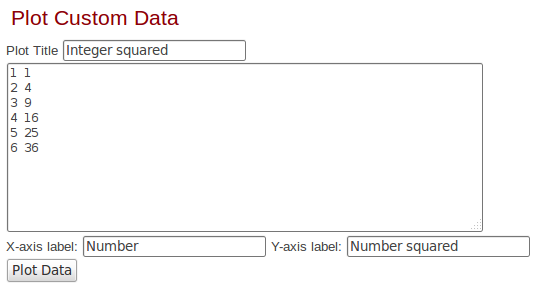
Figure 1: Generate a line plot based on any data.

Figure 2 plots the squares of the first few positive integers using the above method.

Plot of squares of integers
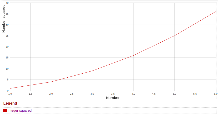
Figure 2: Plot of squares of integers.

But wait, there's more! You can actually export the plot so generated into an EPS, PDF or a PNG file as well, as shown in Figure 3. The file in the EPS format is useful if you are authoring a research article.

Export the plot as an EPS/PDF/PNG file
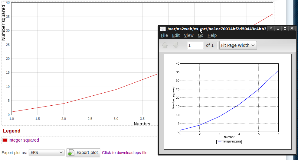
Figure 3: Export the plot as an EPS/PDF/PNG file.
 As you might have noticed, the exported plots look a bit different from the one displayed in the website itself. Indeed, it is so. The matplotlib library of Python is used to generate the plots at the back-end.

Finally, as shown in Figure 4, you can plot multiple line plots together. And yes, you can export such multiple line plots into a single external file.

Plot multiple functions together
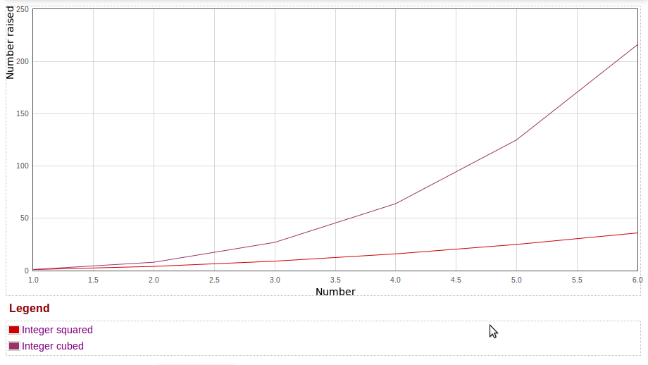
Figure 4: Plot multiple functions together.
So, happy (and easy) plotting!

Comments

Popular posts from this blog

Text Highlighting in Latex

While preparing a manuscript with Latex, it is often useful to highlight the changes made in the current revision with a different color. This can be achieved using the \ textcolor command provided by Latex. For example, \textcolor {red}{Hello World} would display the string "Hello World" in red color. However, the final/published copy of the manuscript does not contain any highlighted text. Therefore, if a large volume of changes were made, it becomes tiresome at the end to find and remove all the individual portions of highlighted text. This can be circumvented by defining a utility command to switch highlighting on and off as desired. In the following, we define a new Latex command, highlighttext , for this purpose. The command takes only a single argument—the text to be highlighted.     \usepackage {color}    % For highlighting changes in this version with red color   \newcommand { \highlighttext }[1] { \textcolor {red}{#1}}   % Remove...

Cohere Aya Dataset: Exploring the Split-by-language Collection

A snapshot of the Aya collection (Bengali) . Image taken from HuggingFace. In February 2024, Cohere launched Aya , a multilingual Large Language Model (LLM). Alongside, a set of datasets used to train Aya has also been released. For example, the aya_dataset consists around 205K examples annotated by humans. On the other hand, the recently released aya_collection_language_split is a gigantic dataset with more than 500 million data points spread across more than 100 languages. As the name suggests, this dataset is split by language. For example, all data points in Bengali, irrespective of the underlying task, can be found in a single split. Apart from the original human-annotated examples from the aya_dataset, aya_collection_language_split also contains a lot of translated and templated data. The dataset is released using an Apache-2.0 license, allowing academic and commercial use. The Bengali Language Split Each language split in the Aya collection has three splits. The Bengali split,...

50K Views of the DTN Blog

The DTN blog recently reached a milestone — it crossed 50,000 page views! The journey of this blog — and that of mine with the ONE simulator — started in 2011. Back in those days, old-timers would recall, there were not much resources available on the ONE simulator. After spending some time with it, I was finally able to gain some understanding about its functionality and work flow. I realized that a short how-to document might benefit others. What started as a humble effort to provide a quick tutorial on the ONE simulator soon became a popular resource in the community over the years. I'm thankful to all the users of the ONE mailing list who continuously kept me motivated to enrich this blog. I took this opportunity to prepare an infographic on the usage of the DTN blog based on the statistics provided by Blogger. It has not been possible to include all statistics in the infographic. A few interesting observations are noted below. Undoubtedly, the ONE tutorial is the mos...